Halo
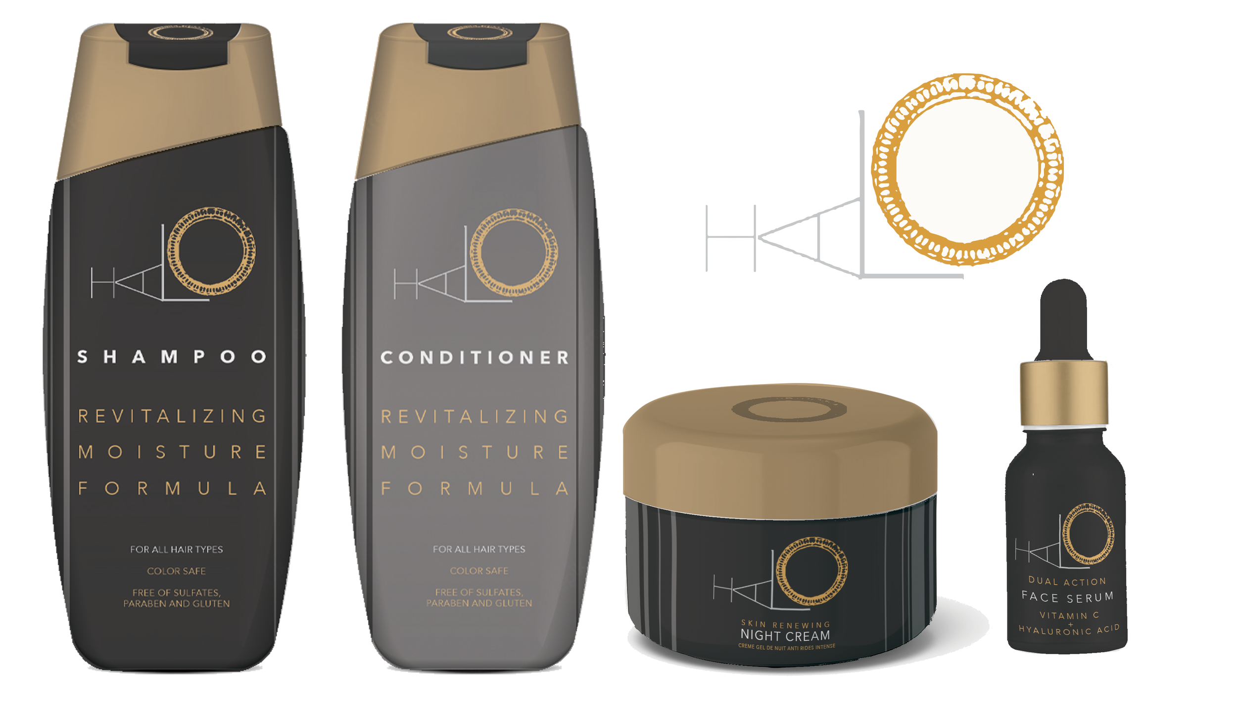
Halo is an e-commerce platform that specializes in crafting premium beauty products. They have been looking to update their logo, which coincides with the release of their latest line of shampoo, conditioner, night cream, and skin serum. The brief called for something which suggests luxury but is also playful. I finally arrived at what you see below after a satisfying journey of trial and error.
The Process:
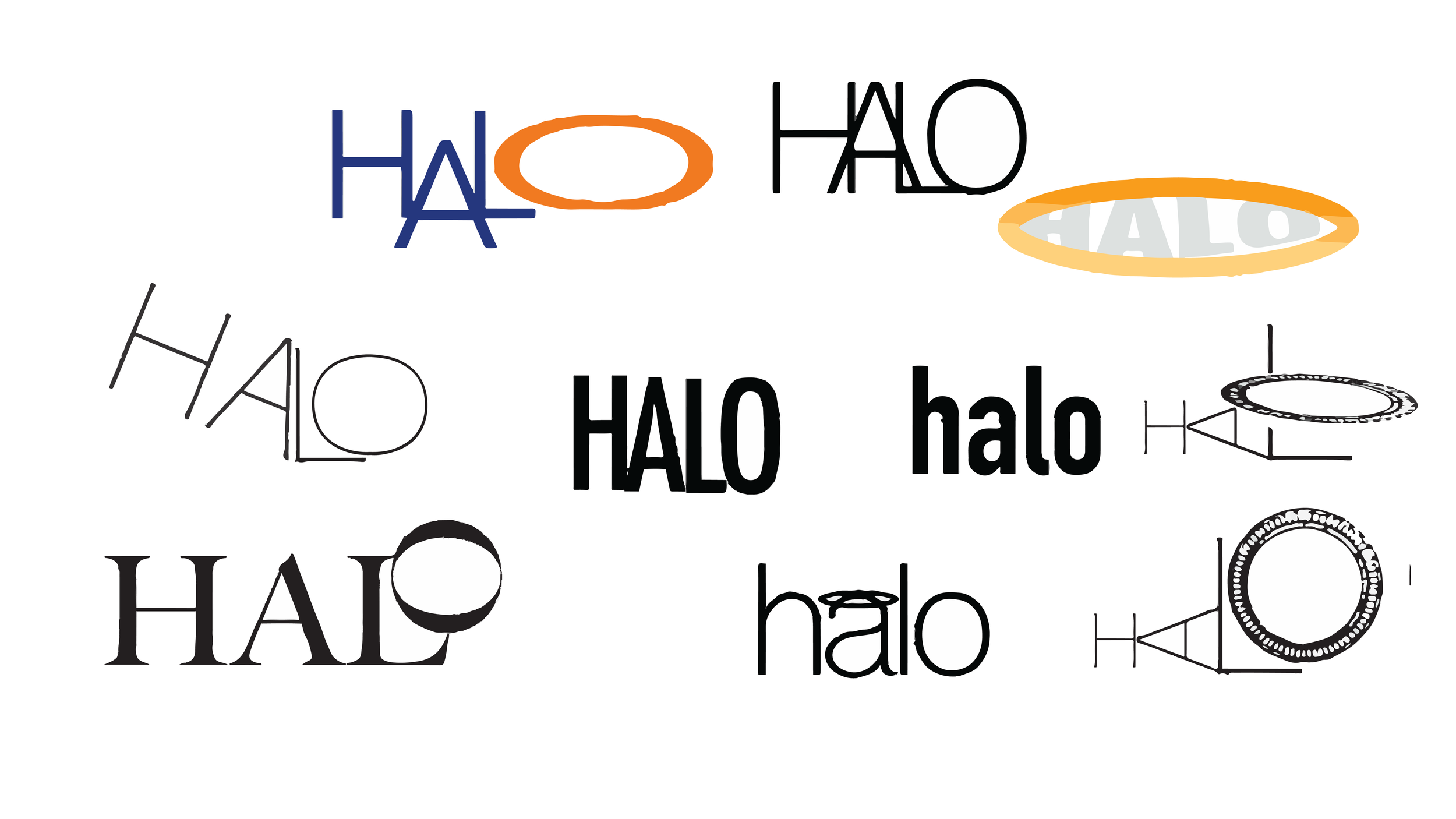
My initial design comprised of a rudimentary layout, featuring the wordmark 'Halo' accompanied by a simplistic illustration of a halo hovering above the product information. Unsatisfied, I proceeded to explore and experiment with various creative possibilities…
The subsequent version of the logo was a study of the letter 'H'. The ‘H’ was modified to incorporate a pair of blue wings with a golden halo positioned above the crossbar of the letter, forming an image reminiscent of an angel. Despite being somewhat amused with this approach, I recognized that the design could benefit from a more sophisticated and conceptually-driven aesthetic, thus prompting me to delve deeper into further diversions…
I explored various typography options for the wordmark. It began to dawn on me that the letter 'O' presented an intriguing design challenge, as I could either isolate it from the rest of the word or completely alter its form. I opted for the latter and incorporated a distressed vector of a circle, which effectively sidestepped the conventional depiction of a halo while still conveying its intended meaning through the circular shape and majestic gold hue. In order to draw emphasis to this central element of the wordmark, the letter 'A' has been rotated counter-clockwise. This adjustment helps to anticipate the ‘O’, which sits snugly within the right angle created by the large letter 'L'.


